

Telstra mobile app (UX)
I helped welcome customers to the new My Telstra, a telco app with over 4 million users in Australia.
📱 Native app iOS + Android
View the app
Who
Jason Wall (UX), Amit Gurung (VD), Bethan Jones (Copy), Sean Murphy (Accessibility).
What
Educate customers to increase app engagement and user retention.
When
Completed over two months in 2019.
Where
Sydney and Melbourne, Australia.
Brief
Telstra was re-building its self-service app from scratch. Part of this involved migrating more than 4 million users over from the old app. For me, the challenge was to design a reassuring welcome to the app and guide customers to its enhanced features. Telstra’s business goals were to increase channel share to 65%, improve user retention by 5% and ultimately grow app users to 5 million.
“Design a reassuring welcome to the app and guide customers to its enhanced features.”
Discover & Define
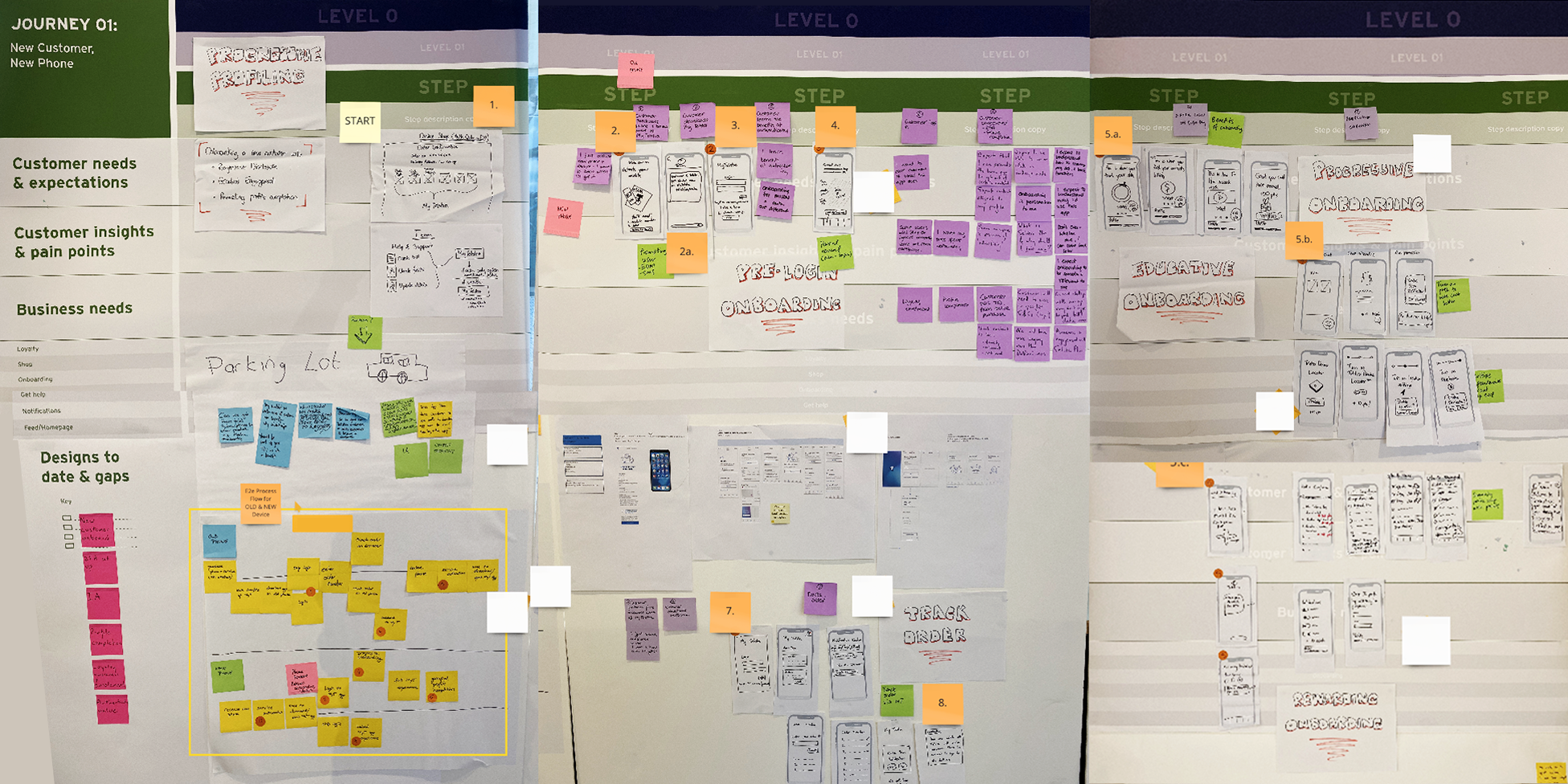
I participated in discovery workshops to learn lessons from the old app and identify opportunities to uplift the new experience. I also reviewed 90 days of previous analytics to see what performed well and uncover friction points. The data revealed issues around sign-in, tour completion and user retention. These insights led me to sketch wireframes focused on two concepts. The first was personalisation, a set of targeted suggestions for the user based on existing data. The second was gamification, a series of pop ups that gave the user incentives to explore features as they navigated the app.
Skills used:
Workshops
Stakeholders
Data analysis
Ideation
Sketching
Wireframes

Test & Learn
I organised three days of user testing at labs in Sydney and Melbourne. These consisted of one-hour interviews with 15 different Telstra customers. I gave participants a series of tasks to complete across two different prototypes and encouraged open feedback. From this, I observed preferences between the concepts, gauged content relevance and tracked choices such as clicks, permission acceptance and follow on actions. The results validated the personalisation idea.
Skills used:
Test planning
Script writing
Moderation
Note taking
Synthesis
Reporting
“The pop-ups are confusing, they're jumpy, so I don't get a chance to see what's on them.”
— Participant, 52 years old

Design & Deliver
Following testing, I made significant changes, including displaying the tour before sign-in and offering personalised follow on actions. Content was a sensitive issue for several stakeholders. I instructed a copywriter to consider feedback and sharpen the language where it was needed. Another challenge was accessibility. I worked with a specialist to gain insights from users with disabilities, including those that use screen readers and keyboards. This knowledge helped me fix the interactions to be WCAG 2.1 AA compliant.
Skills used:
User flows
Documentation
Interaction design
Content design
Accessibility
Quality assurance

Results
30%
Increase in new users completing the app tour.
40%
Extra engagement with
sign-in call to action.
7%
Additional user retention of new customers.
“I love that I can just get on the app and find out everything I need.”
— ★★★★★ App Store customer review, November 2020