

Macquarie Bank mobile & web app (UI)
I streamlined registration flows for Macquarie, a digital bank with 1.7m customers in Australia.
📱 Native app (iOS/Android) + web (Angular)
View the app
Who
Jason Wall (Product Designer), Gretchen Fletcher (Research), Zoe Sheehan (Animation)
What
Reduce friction in registration flows to let users easily link their authenticator app with their main Macquarie banking app.
When
Completed over two months in 2021.
Where
Sydney, Australia.
Background
Macquarie had identified increased levels of fraud activity against their clients. To combat this threat, they needed to increase the number of people using their authenticator app with their primary banking app. Analysis revealed friction points in the registration flow, especially when they asked clients to enter their password to link the apps. A kickoff session suggested several ideas for how I might uplift the flow, including more engaging onboarding and providing an option to scan a QR code.

Foundations
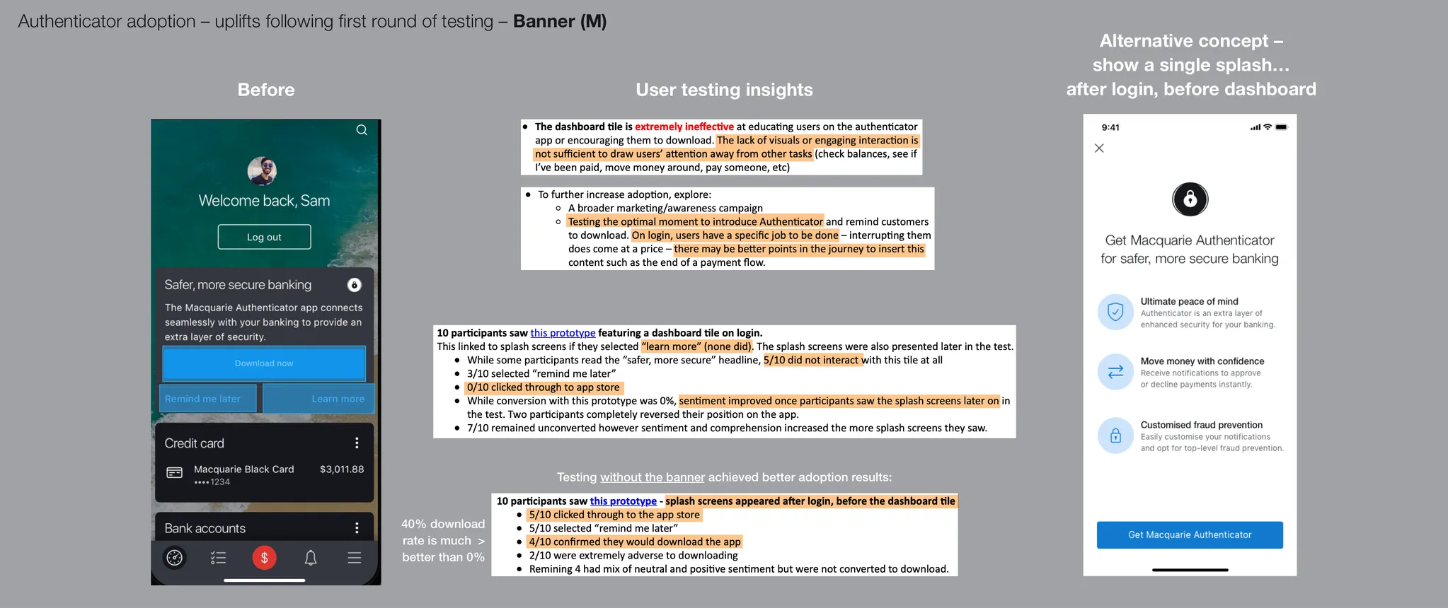
My colleague explored some early concepts and conducted user testing to validate them. The initial hypothesis was that showing an alert on the dashboard of the banking app would engage users to learn more about the authenticator app and register. The results found the notification ineffective for this purpose, with 0% of participants tapping through to learn more. After being prompted, most participants reacted positively to the educational splashes, with 40% clicking through to register. Multiple opportunities to improve the conversion rate were identified, including changes to the feature value proposition and emphasis points in the copywriting.

Explorations
I received rough wireframes from a senior stakeholder and used these as the basis of my initial studies. I built upon this by collaborating with a business analyst and a lead mobile developer to define the end-to-end user journeys and critical interaction points. I then explored multiple concepts for various design aspects including, QR code styling, educational banners, onboarding illustrations and call-to-action buttons.

Considerations
At this point, I reflected on the research and realised I needed to take a new approach. I had to get the customer's attention and bring them into the registration journey. I also identified gaps in the wireframes and put forward suggestions for some additional improvements. These included: instructions for generating the QR code, camera overlay states and different navigations to support a mix of devices. To top things off, I began to see opportunities to add informative delight through animations and transitions.
Developments
I decided to change up the onboarding message from a banner to a full-screen takeover splash. I also made a conscious choice to use bold and high-contrast colour combinations to stand out from the rest of the interface. Furthermore, I worked with a writer to change the tone of voice to be more action-oriented and encourage the user to engage with the registration flow. For the next part, I refined the action buttons to clearly present the options available for the user to link their apps. I also condensed the design of the instructions page to ensure it was concise and easily understood. Finally, I finessed various style details to make sure the visuals and motion designs came through delightfully.

Finished Designs
The final feature designs resulted in a significant uplift to the overall registration experience and bolstered Macquarie’s reputation as a bank that is proactively arming its customers with the best tools to fight fraud.
“This one was worth waiting for... The time has come! Time to experience the new lightning-fast registration experience. Time to bank securely. We are really excited about these changes!”
– Chief Product Owner, Digital Experience
