
Boost Mobile mobile app (UX)
I helped redesign My Boost Mobile, a telco app for the pre-paid market.
📱 Native app iOS + Android
View the app
Who
Jason Wall (UX), Amit Gurung (VD), Dan Macks (Research), Matt Lucas (Research), Kathy Angelone (Copy), Sean Murphy (Accessibility).
What
Redesign app to allow users to manage their pre-paid plan with less frustration.
When
Completed over four months in 2020.
Where
Sydney, Australia. Working from home due to COVID-19.
Brief
Boost Mobile wanted to redesign its self-service app. The business decided to do this by using its sibling app, My Telstra, as a foundation. Boost also wanted to simplify its pre-paid plans through a new tech stack, for better value. For me, the goal of the project was to deliver a better app experience and remove pain-points to reduce the need for support.
“Deliver a better app experience and remove pain-points to reduce the need for support”

Discover & Define
I kicked off with a problem framing session attended by stakeholders. Here, I discovered existing research on the old app, including contextual inquiries with customers and support staff. Part of the report included a wish list prioritisation exercise, which helped me to identify features to be considered for a minimum viable product (MVP). At this point, we ruled out promotions and loyalty, as we decided the team wouldn't be able to do these items justice within the initial time frame.
Skills used:
Problem framing
Collaboration
Research analysis
Prioritisation
Scoping

Test & Learn
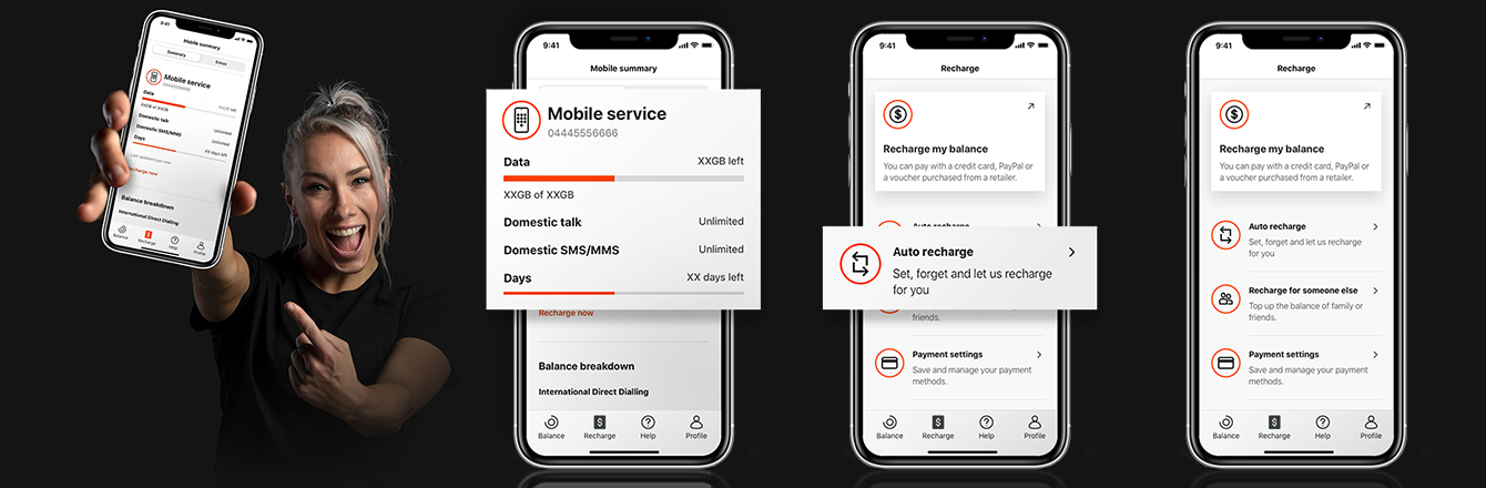
Redesigning the app’s information architecture (IA) was a challenge. The old app consisted of links to web flows. I wanted to change this to offer a true native experience. To validate the new IA, I worked with a research specialist to analyse a series of tree jack tests, which tasked participants to find various features. The results found there were some items that would work better in a different location. Users expected auto recharge and recharge history to be under the payments focused tab, rather than services where I initially put them. These findings were cross-checked with qualitative interviews.
Skills used:
User research
Quantitative analysis
Qualitative analysis
Information architecture
Validation
“It’s setting up ongoing debits, right? So I’d probably be expecting that near payments.”
— Participant, 29 years old

Design & Deliver
After testing, I finalised the wireframes for all critical flows, including interaction details, loading states, error handling and system feedback. I also completed accessibility documentation and voice-over scripting. These changes made a significant impact, as the old app had failed to meet essential usability criteria. I was proud to work with my team to bring the new app up to WCAG 2.1 AA standard. Here, I also contributed to go-to-market strategy, designing content and links to help users onboarding to the new app.
Skills used:
User flows
Documentation
Interaction design
Content design
Accessibility
Quality assurance

Outcomes
Efficient
New IA allows clear and efficient navigation.
Native
Re-designed flows give a true native app experience.
Accessible
New design meets accessibility standards.
“Massive win! I’m so excited to finally have a proper app for Boost customers.”
— Business Owner, Boost Mobile